What we make
Marks & logotypes
A primary lockup plus the variants you will actually need: a compact mark, a light and a dark treatment, and a favicon that is legible at 16 pixels.
Colour & type systems
A palette with defined roles rather than a row of swatches, and a type scale that holds together across a site, a deck and a printed page.
Applied pieces
Business cards, signage, email signatures, social avatars, document templates. The unglamorous items that decide whether a brand looks maintained.
What a finished kit looks like
Not a mood board. These are the real deliverables, the same documents we hand over at the end of an identity project, and both of them are kits we actually run on.
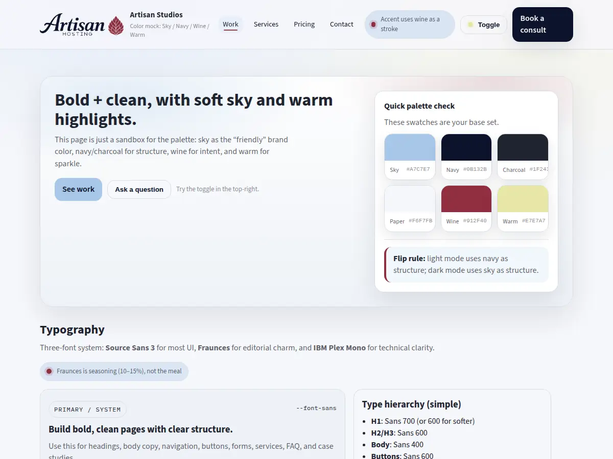 Our own: sky, navy, wine and warm with defined roles, a three-font system, and every component shown in both themes.
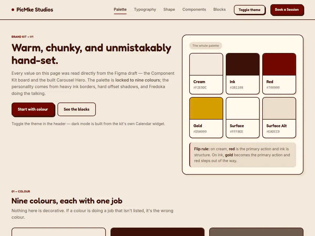 A photography studio kit, drawn from the Figma draft. Palette locked to nine colours, two typefaces, and the layout blocks the site is built from.
Concept kits
Studies we built to work out how a system holds up for a trade, a practice, a cause and a gym. The brands are invented, the systems are not, each one is a complete kit you can read end to end.
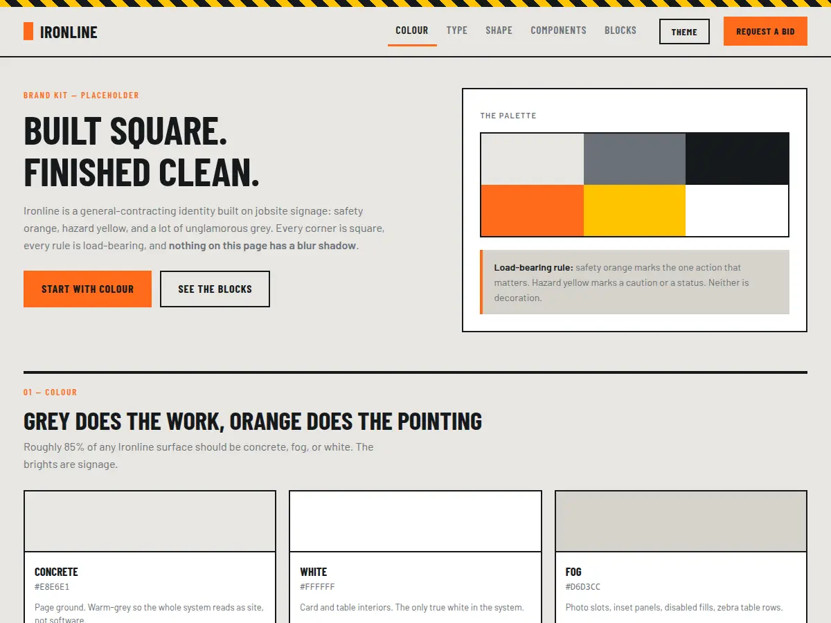 Contracting, built on jobsite signage. Concrete and fog carry the area; safety orange only ever marks the one action that matters.
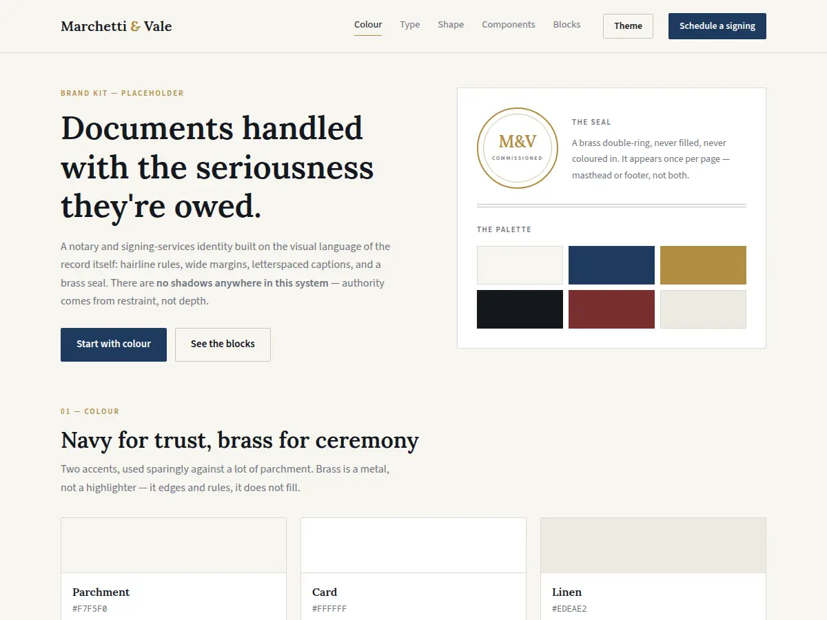 A notary and signing practice, drawn from the visual language of the record itself. Brass rules and edges, it never fills.
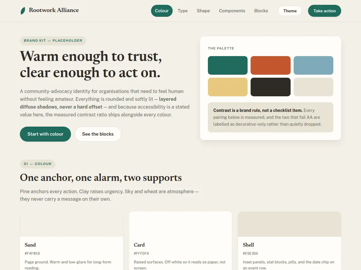 Community advocacy that needs to feel human without feeling amateur. Pine anchors every action, clay raises urgency.
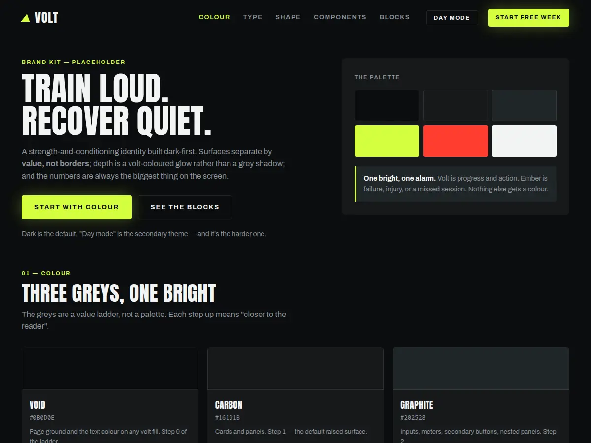 Strength and conditioning, dark first. Three greys as a value ladder, and a single bright reserved for progress and action.
All six open in a new tab, and all six are served from this site rather than screenshotted from somewhere else. Try the theme toggle in each header, a kit that only works in one theme isn’t finished.
Delivered as a system, not a folder of files
Every identity ships with usage notes, exported assets in the formats you will need, and the source files. It is yours.
What you receive
- Vector source plus exported SVG, PNG and WebP at real sizes
- Light and dark variants of every mark
- Colour values with defined roles and contrast notes
- A short written guide, enough to keep it consistent, short enough to read
Why the file naming matters
Assets ship on a strict grammar, so a year from now you can tell which file you need without opening any of them:
artisan-studios__lockup__dark__2048w.webp
name · kind · theme · size. Boring on purpose.